Universtiy of the Arts London x Karina Cooppen
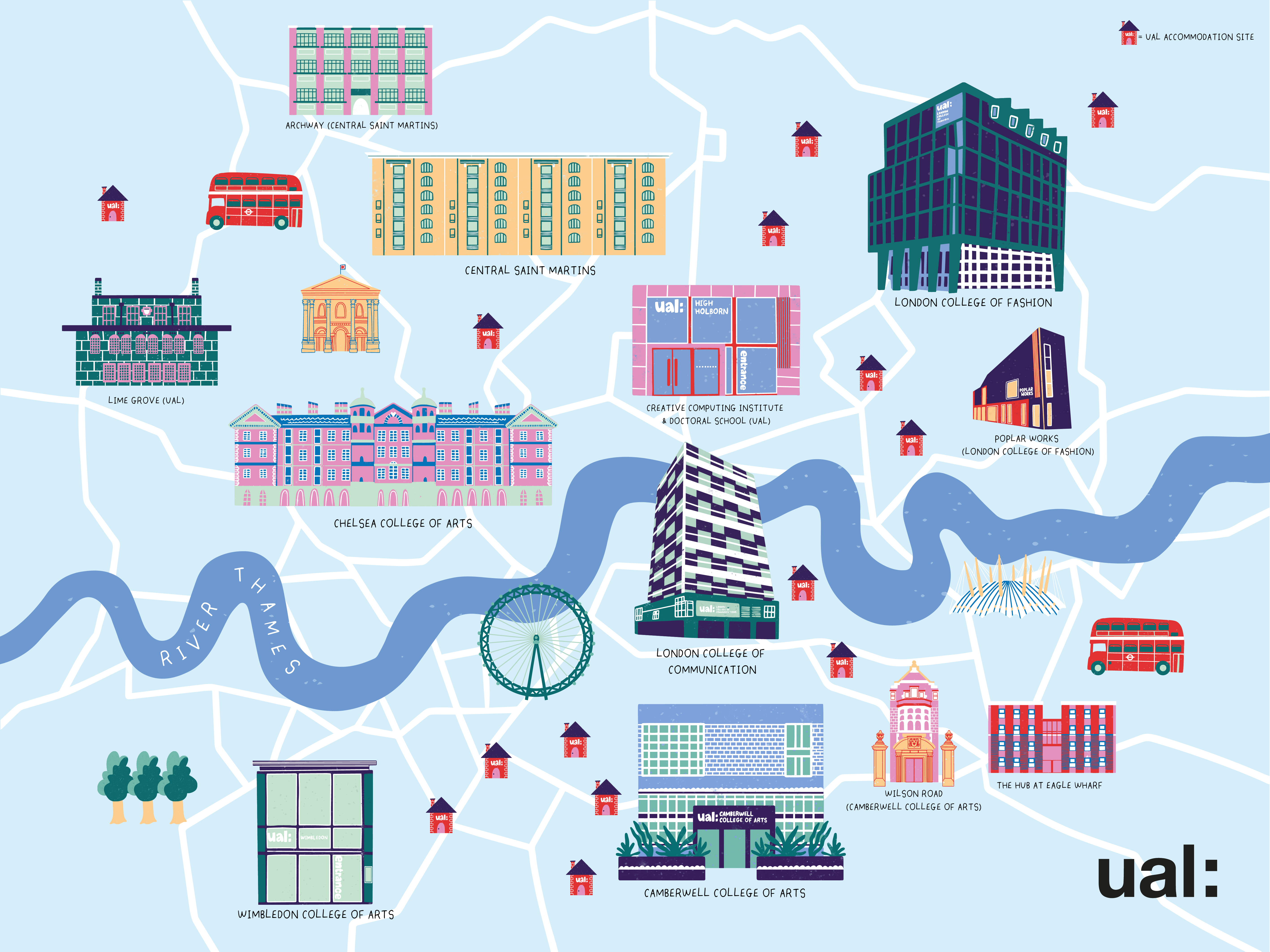
I was commisioned to create this illustrated map of London conveying the UAL campuses and accomodation sites. This 2m x 1.5m map was displayed at the LCF building VIP opening event. I added some london landmarks and the River Thames to help woth navigation but also to depict London.
Final Map

Images from opening event

Photography by Angela Tozzi.
Dreamland x Pride Margate x Karina Cooppen
I created this poster for Dreamland x Pride Margate. They were looking for a new brand identity for their pride event. Working with my client I created a colour palette that reflected the venue of Dreamland as well as keeping in mind the Pride aspect of the event. I added the sand section as I was asked to create a clear divide to show the difference in tickets. The beach town of margate was a great inspiration for this poster as you can see from the lido landmark as well as the summers day beach feel you get from the poster.

Final Poster

Save the Date Post
Instagram Friendly Version
Filler Post
Not Just a Shop Gift Wrap
Final Design

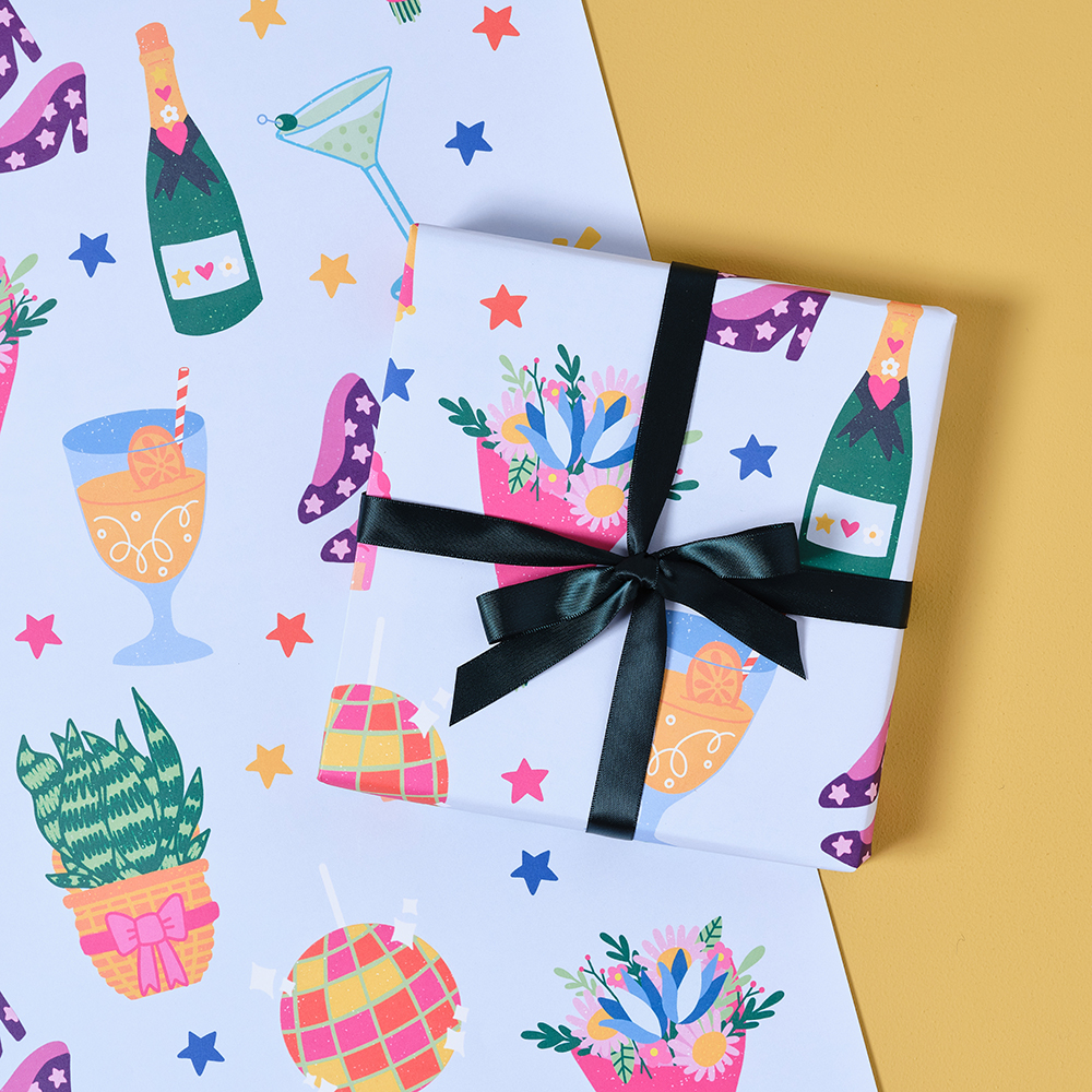
I was commissioned by Not Just a Shop to created a gift wrap design with the prompt ‘celebration.’ I used fun colours resembling confetti to imply the celebration aspect and drew icons that illustrated celebration such as flowers, cocktails and cake.
Mouthy Magazine Cover
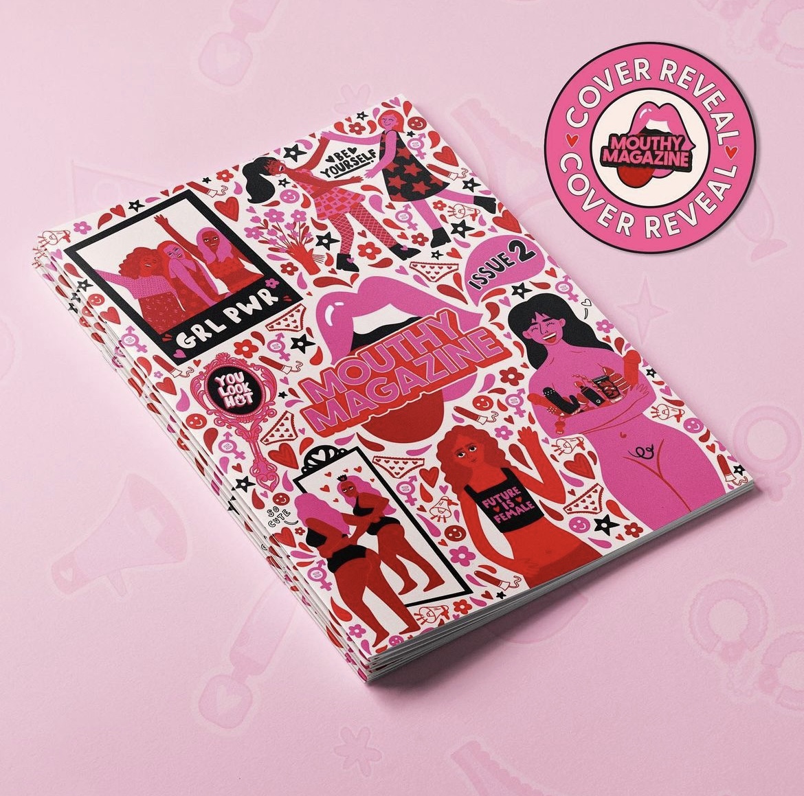
I created this magazine cover for Mouthy Magazine to celebrate their second printed issue. I wanted the front cover to communicate the contents of the magazine and the feminine energy that Mouthy Magazine imply. I used their brand colours throughout the cover and illustrated ‘girl power,’ images such as the girly polaroid picture and the self love mirror illustration. I wanted to give that feel good feeling and positivity which I conveyed with hearts and stars filling the page.

Version 1

Version 2
 Version 3
Version 4
Magazine
Havaianas Advertisment
I created this advertisement for Havaianas flip flops. Using their slogan ‘once on never off,’ I decided to create a colourful collage of images around the flip flop. The flip flop made me think of the beach, park and generally outside. So i drew things associated with the beach and park like ice cream and blankets. I also added natural things like fruit and plants, using nature to contrast the plastic flip flop allowing it to stand out. I also further implied this using bright colours around the white flipflop.
I made this using procreate to create the images and then took it into photoshop to add the logo and image of the flip flop.
Print Social x Karina Cooppen
This was my response to a helping climate change brief. My initial reaction was what are the simplest things that we can do to reduce climate change? After all, it needs to be easy for people to consider doing it. I then thought about a plant-based diet being a good place to start. However, even this I felt was not simple enough for people to try. Therefore, I decided to concentrate on the simple switch to plant based milks as this is something that is easy to do and won't make much difference to people's daily life, hence a more positive reaction to the idea. 15% of profits went to Green Peace UK.


Near & Far Peckham
Postcard I created for Near & Far Peckham. The postcard was inspired by reportage I did on a visit to the pub. I made this using gouache paint and coloured pencil.

Lucy and Yak Fashion Design
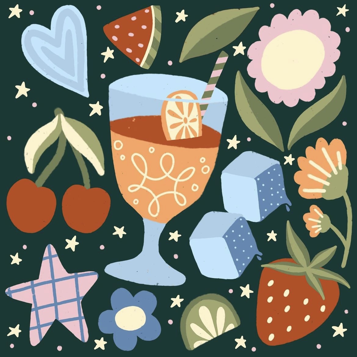

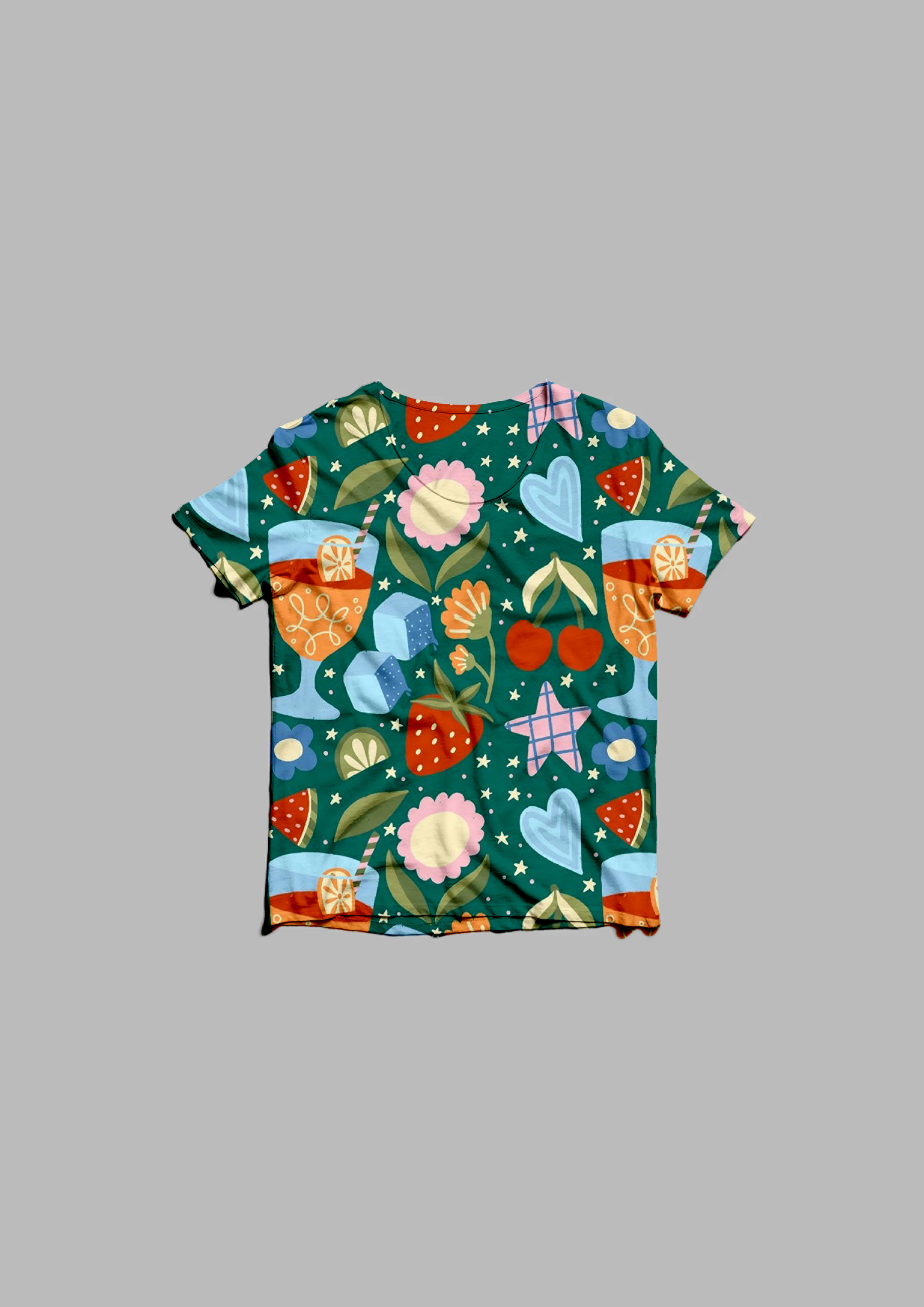
I created this image inspired by a cocktail night I went to in a beautiful green garden. I made this in procreate.
I then took the image into photoshop and made it into a repeat pattern and played around with the background colour.
Finally I drew a portrait using procreate in my style and illustrated what it would look like for this pattern to be on clothing which resonated Lucy and Yak’s aesthetic.
